Showing posts with label Previous DT Work. Show all posts

Saturday, 7 September 2013

Christmas Trees

Today I'm revisiting some samples made for Clarity Take 2 with Maria Simms.
For the first design I made a distressed background using distress inkpads, Antique Linen, Old Paper and Tea Dye.
I stamped the images with Black Archival and then using masks I randomly sponged some pearlescent and gold embossing paste over the design.
I coloured the Carol Music with Rec Distress Ink Pens and glazed with Glossy Accents.
A couple of gems, ribbon and layering and job done.
The second card uses linen texture cardstock with a background covering of pan pastel, Magenta Shade then the trees and stars stamped in a mix of Purple Twilight and Eggplant Adirondacks.
Dots of Star Dust Stickles, gems, ribbon and layering and another finished card.
I hope you like these two very different styles and apologies for the very poor images, in my haste to post them off I hadn't checked the quality of the photo's!
Whatever you're doing I hope you have a good weekend and I'll try and blog some more this weekend too...xKx


Friday, 6 September 2013

Oh, the sight of Duck and Drake...

I don't think I'm alone when it comes to struggling with male themed cards.
So having just recently purchased some of the new Metallic Pan Pastels I decided to have a play and try a design for my Father in Laws birthday.
I used a dark blue card and embossed it with the Clarity 7 x 7 Treescape stencil.
I then used Permanent Red Pans and a mixture of  Bronze, Copper, Rich Copper and Pewter Metallic colours over the design to try and accentuate the embossing.
The thing that has really impressed me with the Metallic colours is the effect when used with a Versamark pad as I've done with the Ducks and the Quote.
 I then drew lines around the edges with a ruler and Versamark pen to give the gilded finish there too.
A quick spray of fixative seals the product.
A bit of layering up and some dots of Enamel Accents and job done!
I'm rather liking these and think a few more male cards will be created with them.
Hope you like this idea, I'm happy with the result.


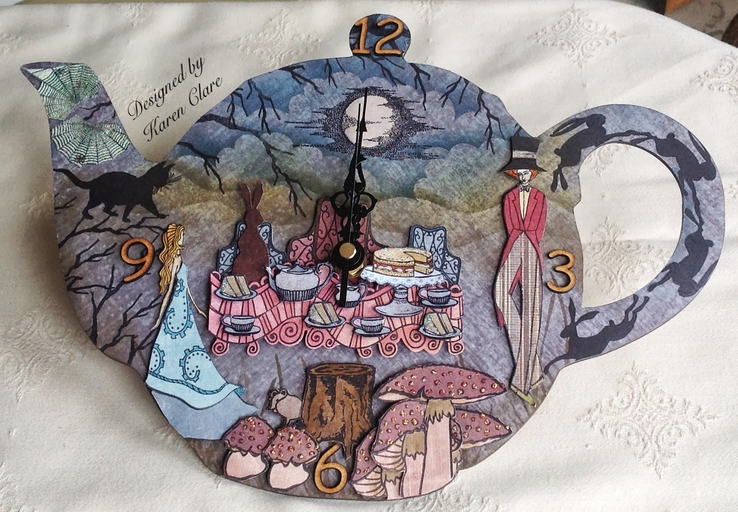
Craft Stamper October edition - Alice in Wonderland Clock

This is the design I created using an MDF teapot clock face featuring all Clarity Stamps and I'm absolutely thrilled that it is featured in the latest edition of Craft Stamper magazine.


Sunday, 1 September 2013

Clarity Stamp New Challenge - Vintage

It's all go this weekend, The Classroom Show yesterday, today's shows and the start of a brand new blog challenge over on the Clarity Stamp Challenge Blog, No 7 already!
The entries each month just keep getting better and better, such a high standard and very inventive ideas.
I have to say I was a bit stumped with the theme of Vintage for this month and consequently time was pressing on to come up with something.
So I decided to use this hanging Bird Cage from
Candy Box Crafts which I've had for a while and really wanted to come up with a twist on the usual vintage style colouring.
Firstly I used a piece of sponge to paint the front of the cage with a pastel pink emulsion paint from a tester pot I had.
I really like using Ranger distress embossing powders so I used this in Tattered Rose with the Clarity Stamps small Leafy Swirl stamp on top of the painted cage.
I had already decided to use the NDC Lovebirds stamp and the large Butterfly and thought the Bird does not Sing and part of the Butterfly Montage stamps would work well too.
The images were all stamped using distress inks and embossed again with the distress powder.
It doesn't show up too well in the photo but the powder gives a lovely vintage feel and texture and it gives a random finish hence the distress.
I mounted the birds and butterfly onto torn paper which I coloured and distressed.
The images were layered with foam pads.
I've also used die cut leaves, Sweet Lilac Paper Flowers, lace and twisted torn paper all of which have been coloured and distressed.
The flower and leaf cluster on the bottom also as a selection of stamens attached and the feather has had a touch of distress ink.
I wanted this cage to look like it had been tucked away in an attic and perhaps the lace and
embellishments were remnants or keepsakes from memorable things.
I was really happy with the way this turned out and the vintage colour and feel it has to it.
Well I hope you enjoy the shows today and all the inspiration the design team have come up with and I hope this will inspire you to take part in the Clarity Challenge.
I'll take some close up images of this and post them later so you can see in more detail.


Thursday, 29 August 2013

In The Bleak Midwinter

I've neglected my blogging so apologies for that, I just don't know where the time goes!
It's nearly Clarity weekend again and I still need to blog my last two cards from this month and the mid month samples I made for Maria, so I better get a wiggle on!
These last two cards were super quick and easy and I chose to use some previously made Gelli backgrounds which I thought worked quite well.
Both were stamped in Cobalt Blue Archival with a bit of ribbon and a few gems added.
With the square card I gold embossed the Carol Music at the top of the aperture section and then blended the snowy hills and sky with a pale moon.
I then stamped all the main trees into position and added the two faded trees in the background.
I particularly like the way the Gelli background colours worked with these stamps and the Cobalt Blue.

I'll be back soon with the mid-month collection!...xx

Tuesday, 13 August 2013

While Shepherds Watched

Morning everyone,
Here are two cards I made for the August Clarity shows with Barbara, I was looking through some Gelli backgrounds I'd made when I was practising a while back and thought the colours would work well.
I was really inspired using these stamps and backgrounds together.
The first card I masked off the moon and created the background scene with the Clarity Hills and Mountains Mask and part of the London Skyline which I hoped might resemble Bethlehem in the background?!..
Inks used were Adirondack Stonewashed and Willow, which I'm a bit addicted too since using the combination at Cowden.
I used a touch of Scattered Straw Distress Ink for the moon.
The Star was stamped and gold embossed and then the figures stamped with black Archival.
The next card I used the die cut layers, I stamped the Carol Music in position first and the created the bright moon with Butterscotch Adirondack.
Again the star was gold embossed and I added some white pen light shafts.
Using black Archival I stamped the characters and then added a partial colour line around to create a glow using Mustard Seed Distress Marker which was also used to colour the Carol Music.
Both these were very simple and straightforward but I was really pleased with the effect.
I hope you feel inspired....xKx


Thursday, 8 August 2013

Clarity Christmas samples

This months samples from C&C with Barbara, I will be blogging about them during the month.
All but one using Gelli plate backgrounds that I'd created while playing , they became my inspiration for these cards.
An overview for you in the meantime...xKx

Missing Piece of My Heart

Hi De Hi Bloggers,
I've scheduled this post to share while I am taking a bit of a break and playing "catch up" with my ever growing "To Do" list! Lol
I'm not sure how that will will work as I know I'll have a back log of  messages and emails to respond to upon my return.
In theory it was a good idea at the time, anyhow this is my make.
It uses the Jigsaw set from the recent Lesson 20 preview of In The Classroom with Barbara Gray.
The two piece stamp set, complete puzzle and single puzzle piece also comes with a mask set of all the pieces which makes it so versatile and pretty fun to use too!
I knew I wanted to create this "idea" and just had to think through how I was going to achieve the desired effect.
I set about practising on scrap paper first.
There may well be other ways of doing this but in the end this is how I did it.
I stamped the complete Jigsaw piece and then masked off the " missing piece" I could then stamp the heart and when the mask was removed "Et voila" you have a missing piece.
The tricky part was to create the correct image in the missing piece.
I stamped the missing puzzle piece onto a piece of card and cut it out.
Then I masked off all the pieces except for the missing piece and in the place of the missing piece I placed my cut out puzzle piece.
This meant that when I stamped the heart in position it would give me the section I needed on my missing piece.
The Letterbox Kit came into play for the wording and I matted and layered the puzzle, coloured with Promarkers.
The missing piece is layered using foam pads and I added a red gem for a bit of romantic interest.
If you are interested in seeing this done in stages in a tutorial let me know and I'll do one.
I hope you like it and that you find some inspiration for using this set...xKx


Thursday, 1 August 2013

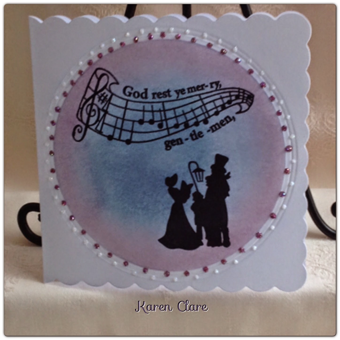
Christmas Carollers

I needed to catch up with blogging and as it's so hot today I've found a cool spot in my living room with the back doors open to sit and do just this.
It was a bit hectic earlier this week as I had to complete my Clarity samples for this weekends TV shows.
They went off in the post yesterday and I have 3 more from the July shows still to share.
I kept them quite simple and used a large circle die cut for the first two, the first using it to create an aperture and the second for an embossed circle.
For the cream linen card I used an Archival ink pad in plum, cut around the stamped images and attached them with foam pads.
I used a stencil to emboss the cut out circle from the aperture and stuck this behind adding gems and ribbon bows to finish.
The second circle design I blended an ink background on the inner circle and stamped with black Archival for nice crisp images.
Then around the outer embossed circles I added two colours of liquid pearls.
The last card uses a circle effect created by masking giving a large moon or street lamp glow effect.
I blended the ink background using the peacock feathers distress ink pad and an ink duster.
I had the idea of creating a group of carollers for this DL card so I stamped the main image and then used second generation ink for the other two sets.
Liquid pearls again for the moon/lamp glow and ribbons/bows to finish.
Well that's my lot for the July Christmas samples, I hope you can pop over and look at the August designs that I'll be sharing.
Thank you again for reading....xKx


Animals

So it's another new challenge over on the Clarity Stamp Challenge Blog
The theme this time is animals.
Thanks to everyone who entered last months challenge, and congratulations to the winner and our chosen top 5, the standard is always so high.
It makes choosing the too 5 a challenge in itself.
So this month I decided to use an MDF plaque for my design, a keepsake you might give a friend.
I painted the plaque in a neutral colour and masked off the large sun before sponging on paints, blue and white for a cloudy effect and green for the grass, then yellow and white for the sun.
I use either Adirondack paint daubers or emulsion tester pots depending on the colour I want.
Washing up sponges, the yellow ones with the green scourers are good cut up to use for dabbing on paint.
I stamped the Deer from the remountable Winter Wonderland set, the Dear Friend greeting and added some texture to the grass using the Lesson 15 remountable texture set.
The Deer and greeting are stamped in Sepia Archival and the grass texture using the paint with the small texture stamp.
The lovely flower and lace are from Sweet Lilac Flowers and gave just the finish I wanted for this little gift.
Jute string is used for hanging.
I hope you are able to join us over on the challenge this month, there's a £50 Clarity voucher for the lucky winner.
I'll be back soon with the last of my samples for July before the launch of the August designs on C&C this coming weekend.
Thanks for popping by....xKx


Thursday, 25 July 2013

Silver Anniversary card

I was asked for a 25th anniversary card and using one of my favourite Clarity stamps, Leafy Swirl       I came up with this. I've added the flower and pearly hearts from Sweet Lilac Flowers
Hope you like it, I'm off to do a commission birthday card now...xKx

Wednesday, 24 July 2013

Contrasting Holly Trees and News!...

Hi De Hi Bloggers,
I still have a few makes from the Clarity C&C July shows to share.
For this I sponged some ink randomly over a piece of card to give a mottled effect then stamped the holly tree in black with a touch of red promarker to the berries. Cut out leaving and edge around the stamped image.
The white tree is stamped and embossed in white, green promarker and red gems, this one I cut to the embossed edge.
Once mounted I added the the candi and faux stitching around the trees and the card edging, simples!
Hope you like it!
Oh and the news!...
I am happy to announce that I will be hosting a crafty session here in Kent, near where I live in Swanley.
"Workshops in Time" and altered art projects with the clock lady
The first date I have to offer is Sunday 6th Oct 10am - 4pm
Lovely venue with great light
Refreshments available all day
Disabled access
Good parking facilities
If you would like to join us for a very informal day of crafty fun, mixed abilities then please email for further info
craftyk@hotmail.co.uk
Limited spaces for the first date


Sunday, 7 July 2013

Overview of this months samples for Christmas 2013

This morning I showed a preview of one of the Christmas tags here it is in full.
I used bit and bobs from my stash to create this and I stamped the image onto an old book page.
I was trying to create a vintage feel by using the different elements to give interest and reproducing the idea of using what's to hand to make Christmas decorations.
I hope you like it, I'll be sharing the rest in more detail over the next couple of weeks...xKx


Friday, 5 July 2013

A Clarity weekend lies ahead...

I thought I'd share this with you just ahead of the Classroom show with Barbara tomorrow.
I've used the birdhouse and picket fence kit layered onto a gellied MDF base.
The idea was adapted from techniques we used at Cowden in May, using the combination of Willow and Stonewashed Adirondack inkpads blended through stencils/masks.
I adore this colour combo, it's so subtle.
The items for the lesson tomorrow look fab so I hope you can join in and get messy!...xKx


Monday, 1 July 2013

Oh I do Like to be Beside the Seaside...

Beginning of a new week, the month of July and a brand new Clarity Stamp Challenge over on the blog...
Let's hope that Summer has finally arrived too and stays around for us to enjoy.
I have wanted to decorate a beach hut for some time now and this one turned into a real labour of love!
The idea of a retro style hut appealed and as usual with this type of thing I wanted to try and recreate a story.
I decided to continue the image on the front, all around the hut and then I decorated the inside, creating a nice feminine changing area and a cosy space to relax and have afternoon tea.
Although this took a while to achieve I was pleased with the end result and think it was well worth the effort.
I hope you like this project and that it helps to inspire with this months challenge theme.
I will upload some more detailed pictures shortly...xKx
Entering into the following challenges:-


Friday, 7 June 2013

Laminated Lily

I absolutely love the Wrought Iron Dog and created this little scene with him and Lily, perhaps walking through the park.
After layering up the the laminated card onto shimmery purple card I added the white punched butterflies as a contrast to the vibrant colour.
Here are two photo's I added the bubbles to the second photo using photo editing for a bit of fun, I thought they were a nice addition...xKx


Laminated clock

I just love the laminating technique we learnt at Cowden and that Barbara demo'd on C&C and
have lots of ideas in the pipeline for clocks using this since trying this first one out as a tester.
It simply uses the Wrought Iron Kite stamp for the design which fitted perfectly for the clock face.
Hope you like it...xKx


All that Jazz!

How cool are these stamps!
Good idea for Father's Day if you're still needing inspiration...
I decided to keep simple in monochrome for these as time was pressing on to complete my monthly samples.
The first sample uses the image stamped three times in a row and I mounted onto black card which I had embossed with diagonal lines using my Hougie board.
Unfortunately this doesn't really show in the photo, I finished with three silver card candy.
The second card shows the diagonal embossing much clearer and I liked the effect it gave with these stamps.
All very simple and nice and quick.
Hope you like them and I'll be back later to share some more...xKx


Wednesday, 5 June 2013

Dolls House

I can't believe it's Wed already, where does the time go!
So it's about time I started blogging my Clarity samples for this months and as there was a huge buzz around the dolls house I thought I'd start with that.
Thank you all so much for the lovely feedback and messages after the TV shows, I really appreciate it.
I will warn you this is a bit of a long post but please bare with me if you can...
So the Dolls House, I was so thrilled when this set of miniature stamps arrived I can't tell you, it was as if Barbara had climbed into my head and read my thoughts!
For me they are just perfect because years ago when my daughter was growing up I use to make 3D picture/shadow boxes.
They were very popular for a while and I had many bespoke orders for them, so around and about people may still have them tucked away somewhere.
I know my nieces adored theirs and I had the best time making them.
The original idea for the shadow boxes came when we took my then young daughter on holiday to the Isle of Wight. I never go anywhere without hunting out crafts or handmade items.
I came across these glass framed shadow type boxes with 3 shelves, they had little items inside like cushions, teddies, little wooden toys etc.
So needless to say as soon as I got back home I was on the make!
I adapted them to my own style and started making my own miniatures from things I had in my craft stash.
I always try and make my own things wherever possible.
I used Dolls House magazines and books for further inspiration, they give good tips on how to make things yourself.
Anyhow I made and sold a few and then was requested to make some more personalised designs, for
christenings and special birthdays which included, a garden and wait for it, a pub! This was a request for someone who was owned his own pub as a special birthday keepsake.
Well I do like a challenge!
I have photo's stashed away somewhere and, I will try and upload them for you.
I also know I still have a haberdashery shop window in my loft so I will post pictures of that.
So that's the story behind the Dolls House and I have been asked more recently if I would go back to this type of thing so this make is my updated version of my old craft.
Barbara asked me to add the link for the actual house frame on her Facebook page so that is there for you.
Now the frame is actually quite deep so the first thing I did was to bring each compartment forward by making a false box base for each section.
I could then decorate each one individually and glue into the frame once finished.
The hardest part as with the clocks is the composition and deciding what to put in each
"compartment" so I decided I needed a little story to help me picture the house in my head.
The story behind this design is that Lily is upstairs getting ready and Douglas is "clock" watching
with the beautiful dog downstairs...
The roof space was always going to be the attic and the rest followed in from there.
My only reservations with this were if the stamped images would do the job of replacing the
miniatures I use to use.
Due to their size I cut some of them after stamping with leaving a "frame" around the edge.
I used some papers I have had in my stash for a long time and sorted out a selection that would work together a bit like decorating your house!
I used the papers for the rooms and to stamp the images on to, which worked quite well for this.
Now the most important thing is something my dear Dad, bless him, taught me years ago and that is you can create an illusion of something that often works as well as if not better than the real thing, I have used this theory and it has worked for me very well during my crafting times.
So I worked out where I wanted my Clarity miniatures, the cushions are from the haberdashery set
edged with mini ric-rac.
I then turned to my boxes of ribbon trimmings, buttons, beads etc for adding finish touches of
inspiration.
I used lace, buttons, gems, cut bead from the lengths of mini beading you can buy, some Prima flowers and
the clock face was in a little set that was free in a magazine.
So you can create an illusion of pretty things by adding unusual buttons, gems and bows also by make beads look like pretty perfume bottles.
The vase on the table is actually the large Clarity vase cut down as I don't have a mini one.
You can see I've edged the house unit with mini ric-rac and ribbon and that's about it, if there is anything else you want to know about this project please don't hesitate to contact me.
I'll leave you with the images...xKx


Monday, 3 June 2013

June TV Samples with Clarity Stamps

Good afternoon,
Hope the start to your week is good.
I have been busy planning projects this morning, a few things in the pipeline...
This is the showcase of my samples from the weekends shows and I will be blogging fully during this month.
Thank you for all the lovely feedback and comments regarding my samples, I'm delighted if they inspire you further.
I'll leave you with a montage of my samples and hope you have a good week ahead xKx